THE KARUAH Progress Association (KPA) has received 27 design concept submissions for a new town logo, more than 100 community comments, and discovered a clear town favourite.
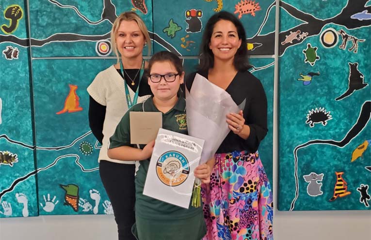
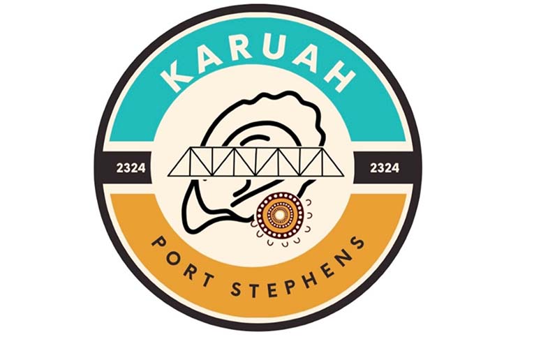
Local Year 4 student Leiana Manton’s logo (no.11) received 734 votes as the highest ranked concept, several hundred votes higher than the runner-up.
 Advertise with News of The Area today.
It’s worth it for your business.
Message us.
Phone us – (02) 4981 8882.
Email us – media@newsofthearea.com.au
“Given the fact that Leiana’s design is preferred by the majority of the community, we have decided to send it to the professional designer to be modified for use as the official Karuah logo,” Marion Brown, Secretary of the KPA, told NOTA.
“Meg Bartley, of Artley Designs, based on the Central Coast, will then summarise the submissions into a good cross-section of the community’s desires, but the final logo will be based on Leiana’s design.”
KPA President Breanna Landwehr told News Of The Area, “The KPA engaged Karuah Public School in 2023 to assist in design ideas for a new logo.
“We would like to thank all the students and extended community for their creative and thoughtful contributions, especially Leiana.
“Funding for the logo project has come from the Foundation for Rural and Regional Renewal (FRRR), and the logo may also feature on potential merchandise, fostering community pride.”
“We will invite Leiana along the journey so she can share the story of this logo and what it means to her, which can be captured and shared in the future website, through the local newsletter, and beyond.”
Leiana is a descendent of the Worimi people of Port Stephens, and her father is a fourth generation oyster farmer of 26 years.
“I’m happy, excited,” Leiana said, “this is the first time I’ve put anything into a competition.
“The bridge connects the north to the south, the oyster is for the oyster farmers in Karuah, and the Aboriginal ‘meeting place’ symbol is a First Nations representation of the whole community coming together,” Leiana told NOTA.
“I wanted to make sure that the whole community is included, Worimi and non-Worimi people.”
Leiana’s mother Pearl is very proud of her daughter’s efforts to promote the local community.
“I’m glad that she’s taken it on,” Pearl said.
“Having a logo is significant for Karuah, it is a good opportunity for somebody her age to be able to do it.”
By Thomas O’KEEFE
